Oversized typography
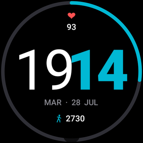
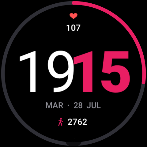
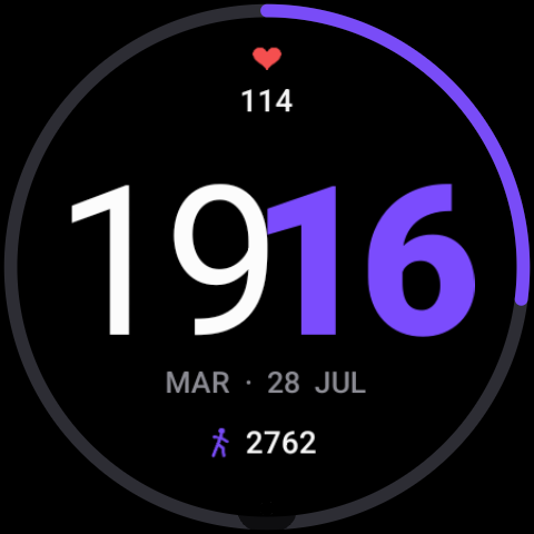
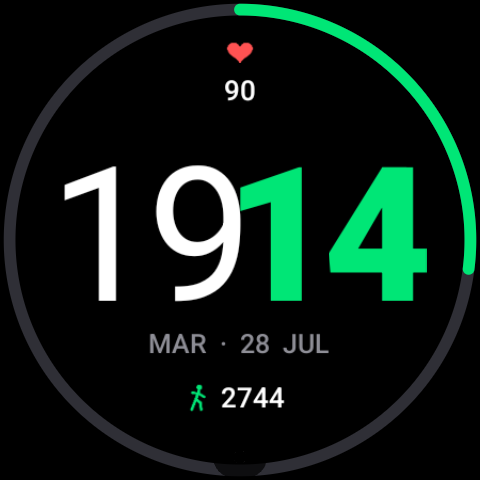
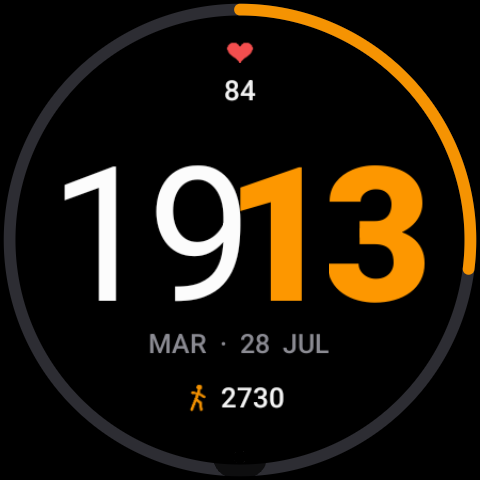
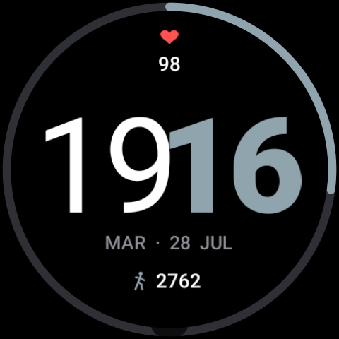
Hours and minutes fill the dial with a heavy geometric face, split by color so you read the time in a single glance.
New Built for Wear OS 4 & 5
Pure Time is a bold, typography-first watch face for Wear OS. Pure black for AMOLED, six vivid accents, and the data you glance at most — nothing else.
No clutter, no widgets you never use. Just the information you actually check, rendered at a size you can read without lifting your wrist twice.
Hours and minutes fill the dial with a heavy geometric face, split by color so you read the time in a single glance.
Heart rate above, steps below, and a battery arc tracing the bezel. Three signals, updated in real time, zero taps.
A pure #000 canvas keeps AMOLED pixels off. Always-on mode dims to a low-power variant that still reads perfectly in daylight.
Cyan, magenta, violet, green, amber and steel. Switch in the watch face editor — the accent recolors the digits, the arc and the icons together.
Scales cleanly across Wear OS displays, from compact 1.2" round dials to the largest flagship screens, with no cropped edges.
No accounts, no analytics, no network calls. Everything renders locally on your watch — and that is the whole privacy policy.
Tap any color to preview it on the dial above — the whole page follows along.
A single paid download on Google Play. No subscription, no in-app purchases, no ads.
Install from your phone and Google Play pushes it straight to your paired Wear OS device.
Hold the current watch face, tap Edit, and pick your accent color. That's the whole setup.
Tell us what you'd like to see on the dial. We read every message and usually reply within two working days.